Great graphics are key to the success of your exhibit. You can have the coolest structure in the exhibit hall, but if your graphics are mediocre, your booth will not be successful. Since your exhibit is an extension of your business, you need high-quality, effective graphics.
Graphics are the visual presentation of your company. They consist of the messaging, colors, and imagery. But they also involve the fonts, color matching, lighting, and substrate among other factors.
Messaging
Your messaging is critical. The less is more concept applies here. As people walk past your exhibit, you have less than 10 seconds to get your message across, so the fewer words the better. Your main message should be no longer than six words. So, make them count. They should focus on the benefits to the visitor in order to pull the visitor in. Keep the words simple and clear.
Once the visitor is in the booth, other graphics can be used to identify different areas in the exhibit and different presentations. Graphics can also be used to inform visitors of additional benefits to your products or services. Avoid putting too much detail into your graphics. The details can be put in brochures and other handouts that the visitors can take with them.
Colors
Your colors may be dictated by your company’s formal color scheme. There should be cohesion between your booth colors and your other marketing materials. If you are not limited to a formal corporate color scheme, then select colors that provide a sharp contrast. Contrasting colors are easier to read. Choose either light on dark colors, or dark on light for contrast. And limit the number of colors to two or three for a more unified look.
Imagery
The imagery is the logo, pictures, or words that may be on your graphics. It is the ultimate message to your booth visitors. Any image used will have to be very high resolution. When the image is blown up to exhibit size, low-resolution pictures will become pixelated and fuzzy. You want very sharp, clear images and graphics.
If you are using pictures in your images, make sure there is sufficient room for any text and that the text does not overlap with the pictures. Such text is difficult to read.
Fonts
The right fonts can help get your message across. For clarity and visibility, sans serif fonts such as Helvetica, Arial, or Futura are a great choice. They are clean, simple, and easy to read. Popular serif fonts, such as Times New Roman and Adobe Garamond, are harder to read and should not be used unless they are a key part of your brand identity. You also should not use more than two different fonts in your exhibit. Script fonts should be avoided at all costs. They are extremely difficult to read.
Your text also needs to be readable from various distances. An experienced graphics company will need to know where your graphics are being placed, so that the graphics can be sized properly. Banners that will be viewed from 50 or 100 feet away will need to have much larger font sizes than those graphics that will be viewed from 15 feet away.
Color Matching
If you are trying to match your corporate logo colors, make sure that your graphics company knows the exact colors you are trying to match. If you give them CMYK color numbers, be aware that these colors can look different in print than the colors on a computer screen. When printed, these colors generally come out darker and flatter. If your graphics company matches colors, it should understand that and give you a color that will be a true match. Keep in mind that lighting behind the graphics can also affect the appearance of the colors.
Lighting
Proper lighting can enhance the effectiveness of the graphics in your exhibit. There are dozens of different lighting methods, and each can have a visual impact on your graphics. They can also have an impact on the longevity of the ink and the materials used in the graphics. So, it is important to coordinate the lighting with the graphics, so that your graphics company can select the right inks and other materials for the exhibit conditions.
Substrate
The substrate is the substance on which the graphics are placed. Most large-scale graphics are done on fabric because it is flexible and lightweight. But there are many other substrates available: wood, adhesive-backed vinyl, mesh, printable wallpaper, metal, sintra, acrylic, Foamcor, and laminates. You will need to discuss the substrate with the graphics company and the exhibit builder, along with your needs. An exhibit that will only be used once will likely utilize a different substrate than one that will be used 20 or 30 times a year.
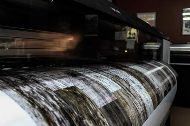
IMPLUS graphics being printed
People generally underestimate the graphics needs for exhibits. Many people also assume that the graphics artist that created their corporate literature can handle their exhibit graphics needs. But these are two entirely different fields. You need to use a real expert in exhibit graphics.
You can retain a company that solely does exhibit graphics, or you can utilize an exhibit company that does the graphics in addition to exhibit fabrication. There are two primary advantages to utilizing an exhibit company with in-house graphics. First, it is much easier to coordinate the graphics and the booth design when both departments are in the same building. If there is a change in booth design, the graphics department will be aware of it and can adjust accordingly. The second advantage is that if there is a problem with the graphics when the exhibit is assembled at the exhibit house before shipment, the graphics don’t have to be sent back out to the graphics company to await the fix. The graphics house can take care of the issue immediately.
Let our expert graphic design team make your brand message unforgettable! Give us a call today!


Key Account Manager